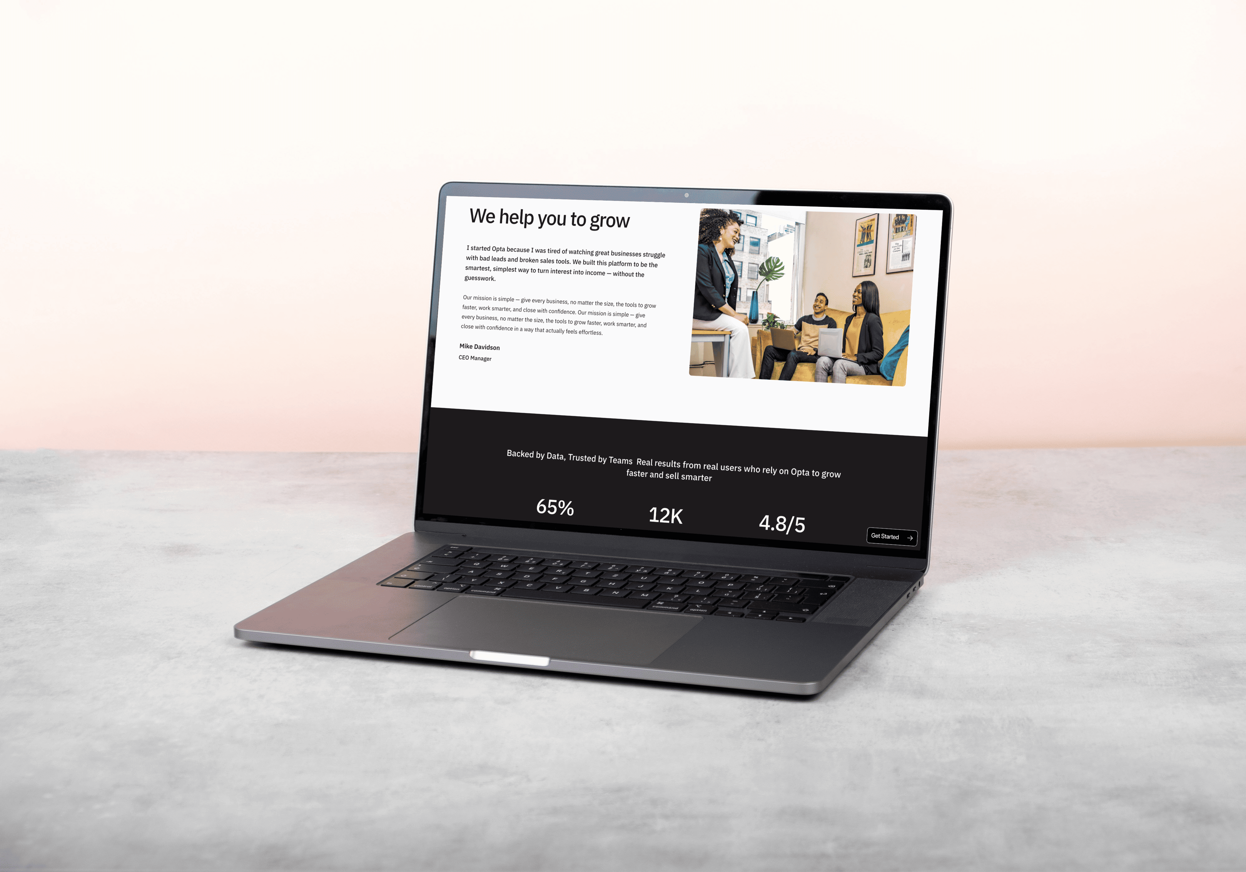
Opta is a modern productivity platform designed to help individuals and teams streamline their workflow and focus on what matters most.
I led the design and development of their landing page with a clear vision: to create a lightweight, elegant digital presence that reflects simplicity, clarity, and focus — the same values Opta promotes in its product. The design needed to feel calm yet powerful, positioning Opta as a thoughtful solution in a crowded productivity space.

The Problem
Productivity tools often overwhelm users with cluttered interfaces, noisy messaging, and bloated features. Opta wanted to distance itself from this pattern and needed a website that communicated its minimalist approach while still conveying depth and value. The challenge was to build a landing experience that would instantly resonate with users who are seeking focus, not complexity — without sacrificing visual appeal or brand strength.
The Goal
The goal was to create a landing page that feels refined, intentional, and aligned with the product’s core promise: simplicity that drives results. The page needed to be fast, responsive, and visually minimal — guiding users through a smooth narrative of what Opta is, how it works, and why it’s different. Above all, it needed to build trust and encourage action through design clarity and a well-structured user flow.
I crafted a clean, responsive site that mirrors Opta’s minimalist philosophy. The design features generous spacing, soft motion, intuitive layout, and just the right amount of detail to keep users engaged without distraction. The page walks visitors through the product’s benefits, use cases, and philosophy using smooth scroll effects and clear calls-to-action. The final outcome is a focused, elegant site that positions Opta as a trustworthy, thoughtful productivity tool.